Renovations

Historic-Modern Four Square Kitchen

We had the pleasure of designing a new kitchen in this four square historic gem built in 1929. The trademarks of a four square home include a square, boxy design, with four large square rooms on each floor. These homes were known for often incorporating handcrafted "honest" woodwork. End history lesson!

Now, let’s get into the fun stuff! We love projects where there is a Tetris-like challenge that present interesting solutions on the design end that makes the project just that much more rewarding. We were confined to the four walls that enclosed the kitchen because we couldn’t expand into any other space, as it would have been too costly structurally. We also had two support beams in the ceilings enclosed in a bulkhead that we had to design around. As you’ll see, the bulkhead is in the center of the room. We started by centering the range on the bulkhead to line it up visually. With that as a starting point, we were able to get the rest of the design rolling.

KKD_Deaner_Home-16.jpg
Before

Before

One of our intentions while designing this kitchen was staying true to the era of the home, but also blending in modern elements to update the space. We sourced new interior doors with a classic look. The glass helps to create a visual connection with the adjoining rooms.

We wanted the kitchen to flow with the rest of the original features in the house, so we used inspiration from the dining room built-ins for the custom kitchen cabinetry by mimicking the clover leaf profile on the cabinet doors. We also designed them to be inset, which would have been accurate to the period of the home.

KKD_Deaner_Home-28.jpg

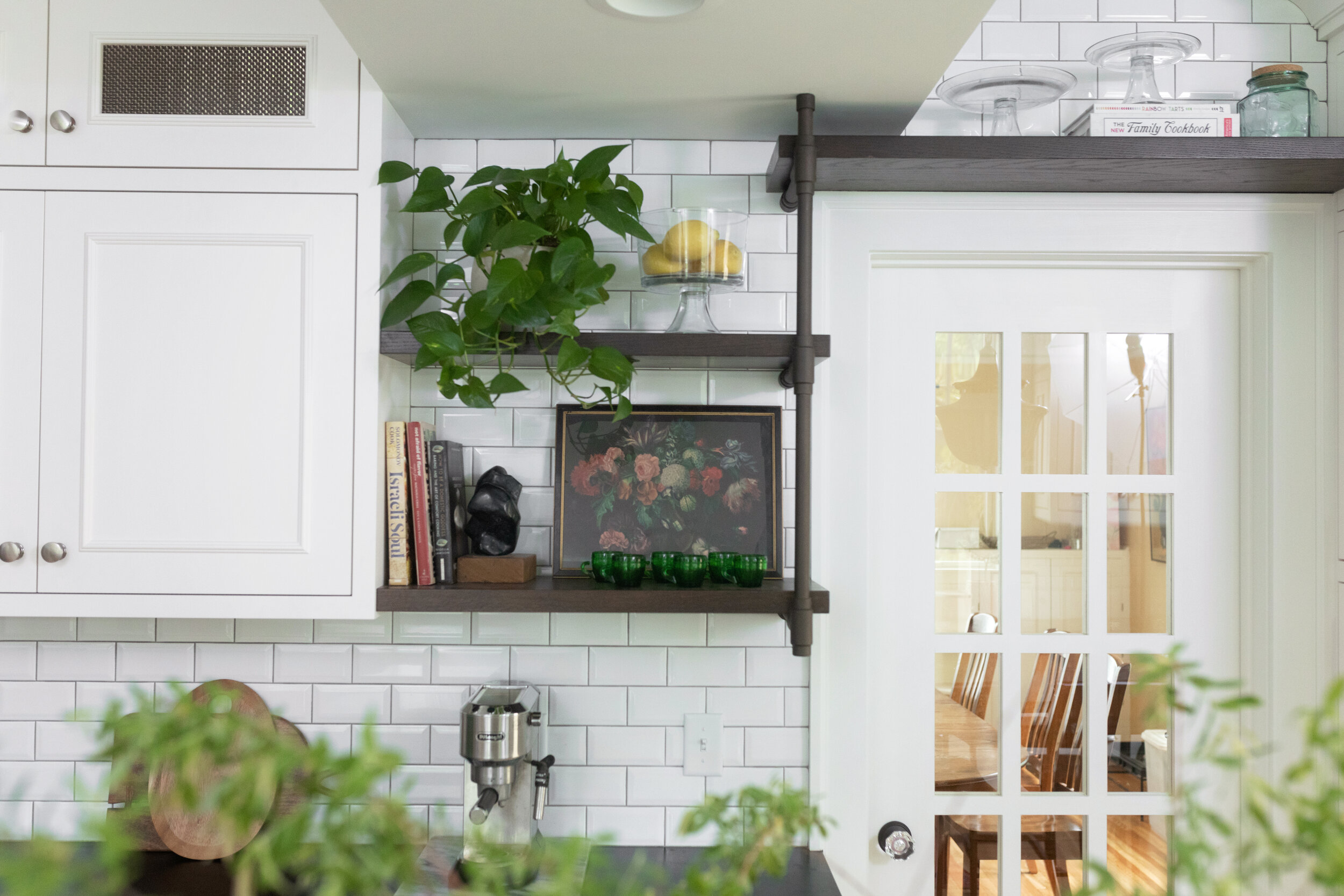
While staying true to the classic design of the house was important, we also needed to add modern day elements. We incorporated custom metal shelving with a stained oak shelf, which also ties in with the oversized butcher block island. For continuity, the same metal shelf design was used for the support legs on the dining portion of the island. It gives the space a modernized industrial feel, while the cabinets and soapstone countertops are reminiscent of the era of the home.

As you’ll see throughout the kitchen on the open shelving, we decorated with a mix of antique and handmade items for a collected feel in the kitchen, focusing on things that were not only functional but also beautiful. The green espresso cups were a fun find from Etsy that pulled in the green from the walls and are used daily.

KKD_Deaner_Home-21.jpg

Subway tile would have been used in this home back in the 1930s, but to update it, we chose a beveled subway tile, along with a medium gray grout. We wanted to give this little kitchen some dimension and interest.

The vinyl flooring was removed and then we continued the original oak hardwood flooring that also covers the rest of the main floor. This simple change made for a cohesive and seamless transition.

The family wanted this to be a place where they could share meals, do homework, or set up by the espresso machine to work from home. Gathering around the island for meal prep or to enjoy a home-cooked meal was important to them, so we designed the island to be oversized, with seating on one end to enjoy each other’s company.

The other fun detail we added to this kitchen was a gallery wall full of the family’s history. We were able to choose from a wonderful mix of art and vintage family photos to create a wall that told their story. We placed collected campaign pins in a shadowbox, reframed black and white family photos, and incorporated art from their existing collection to make this kitchen feel personal to them.

We also did a refresh to the small powder bathroom that you can see from the kitchen. We bumped up the saturation of the same green paint that we used in the kitchen. After removing the old flooring, we added a fun black and white checkerboard tile to give this little bathroom some character of its own.

KKD_Deaner_Home-64.jpg

Keep following us here and on our Instagram for updates on our current projects!

Cabinetry: Ascent Fine Cabinetry | Instagram
Contractor: Perkins Custom Remodeling | Instagram
Photography: The Mitten Tog | Instagram

Warm & Welcoming Main Floor Renovation

Photo Oct 06, 11 30 28 AM.jpg

Because our client has a love of baking, let’s start this renovation in the kitchen. Her main goal was a classic and neutral overall palette with a lot of texture built in - and we definitely were able to give her that!

We kept the cabinets a classic white, but gave it a nice contrast in the gray island. We also added some modern features by using black cabinet pulls, a black faucet, and pot filler.

One of our favorite features in this baker’s paradise is the decorative marble tile backsplash under the range. It was also important to our client to have both the range and the wall oven to indulge her time in the kitchen.

Kitchen Mood Board

Kitchen Mood Board

Kitchen before

Kitchen before

Because of the massive dining table, we doubled up two lantern-style chandeliers and we needed the lighting in this space to balance the weight of it visually. It casts the right amount of light, but doesn’t overwhelm the space.

For some visual interest in the dining room, we incorporated this beautiful vintage piece from The Honeysuckle Co.

Photo Oct 06, 10 43 41 AM.jpg

Moving from the kitchen to the living room, we renovated the staircase railing, balusters, and stair treads, which completely changed the aesthetic of the room. The rich wood stained railing ties the wood tones together throughout the entire space.

Living Room Mood Board

Living Room Mood Board

Photo Oct 06, 11 21 11 AM.jpg

We also tackled the fireplace by giving it a facelift. We used shiplap and decorative wood mullions to created the gridded pattern. We included the same quartz used on the kitchen counters to tie both spaces together.

In both spaces, we used Coretec vinyl planking which is durable - with three kids and a dog, that was very important! We then tied the floor into the fireplace by using a dark wood stain on the wood mantle.

Cozy and inviting was the name of the game in the living room. We chose leather armchairs and a neutral rug to blend with the coffee table and the sofa that the client already owned. We love that they fit in with our overall design.

Living room before

Living room before

The main floor also has a powder room that needed updating. We used a textural wallpaper and paired it with a vanity that is open below. In a small bathroom like this, it really helps make it feel like it has a lot of floor space.

Powder Bath Mood Board

Powder Bath Mood Board

Powder room before

Powder room before

We used the same quartz from the kitchen for a backsplash to protect the wall and tie it in to the rest of the main floor renovations. We also chose a really fun wall-mounted faucet.

Photo Oct 06, 10 23 24 AM.jpg

The last space in this main floor renovation is the foyer. We continued the vinyl planking and added a welcoming rug. We chose this large print from Juniper Print Shop and topped it off with a small stool and some greens.

Photo Oct 06, 11 46 35 AM.jpg

Grown Up Glam Guest Bath

Today we’re looking at a guest bathroom that started out as a laundry room and full bath combined. The client wanted a nice-looking and functional guest bathroom, so we divided the space into two separate rooms, working around the existing skylight to give the bathroom a ton of natural light.

Light was actually a very important aspect in the guest bath for the client, so we incorporated an LED medicine cabinet for both its storage and extra recessed lighting, and brought in gold sconces to bring out the client’s glam side.

The vanity is in this nook where the washer and dryer used to be.

The vanity is in this nook where the washer and dryer used to be.

We wanted to fit a full tub in this bathroom to make it feel like a serene getaway at a luxurious hotel, so we placed it in the center of the room. We included double doors on the shower/bath combo so that you wouldn’t feel caged in should you want to unwind at the end of the day with a bubble bath. We added brass details to match the vanity.

To keep the palette simple, clean, and fresh, we used a textured subway tile in the shower and behind the vanity. For an added layer of texture and interest, we chose a grey, geometric wallpaper, and to tie everything together and ground the space, we went with a black floor. Because of the cool tones of the tile and wallpaper, we brought in some natural wood with the cherry vanity and matched the floating shelves in the nook to the vanity to warm it up.

Photo Aug 19, 10 38 50 AM.jpg
Photo Aug 19, 10 32 24 AM.jpg
This before pictures shows the  skylight and toilet location, neither of which were moved in the renovation.

This before pictures shows the skylight and toilet location, neither of which were moved in the renovation.

The rest of this renovation can be found here.

Other links:
Perkins Custom Remodeling
Direct Supply, Inc.

Black and Mod Basement Reno

1061AutumnRidge_28.jpg

This client had a clear vision of what they wanted this space to be and how they wanted to use it because it would be a multi-functional space in this one area.

The main space was created for TV viewing. Whether it’s curling up and relaxing or watching a big game, this are needed a big comfy couch to set it apart from the rest of the space.

It’s easy to be wary of dark trim in a basement space, but with so much light we went for it! Dark trim and a black shiplap on the projector area and the kitchen island tie nicely into the black and white theme of this space. We warmed it up with the flooring and wood elements throughout the space.

The next space is behind the TV viewing an area - a place for entertaining. The fireplace was completely updated. We wanted it to have a concrete look, but a full concrete fireplace wasn’t in the budget, so we selected a tile that looked like concrete. From there, we created a grid pattern and divided up the sections with metal strips to give it a more interesting look, and less like we just tiled the face of the fireplace.

From there we added a seating area for happy hour drinks and accent lighting to either side of the fireplace. It gives the area a good wash of light over the client’s artwork and adds richness to the space.

1061AutumnRidge.jpg

Next, we created a large bar area with a lot of seating so you can see the TV from any spot. We added a kitchen with beverage coolers and included a dishwasher and sink. No bar space would be complete without open shelving to display adult beverages!

1061AutumnRidge_68.jpg

Next to the bar area is a wine room. Originally we wanted to make the space under the stairs flush with the stairs, but we weren’t able to do that. Instead, we added the detail of the glass sides so you can see into the wine room. We stayed true to the original structure, but made it a focal point and a place to store wine that was also near the bar.

1061AutumnRidge_46.jpg
1061AutumnRidge_35.jpg

Don’t worry - we didn’t forget the kids! Beyond the custom-made pocket doors is a playroom space just for them, with a guest room for family and friends.

1061AutumnRidge_74.jpg

The last space in this renovation was the bathroom. We kept on theme with the black and white to tie in with the rest of the space, but we let loose and got a little funky. We chose a floating vanity and prismatic black tile behind. To offset the circle mirror, we used fun geometric lighting.

1061AutumnRidge_24.jpg

The Serene Master Bath

For this project, our client had a very clear vision - contemporary, but not too modern with some classic elements. With that in mind, we started by removing the corner garden tub and installed a free-standing slipper tub in its place. For an added touch of interest, we added a chandelier above it.

Garden tub could use a little improving, don’t you think?

Garden tub could use a little improving, don’t you think?

Because there was so much natural light in this space, we weren’t afraid to go darker on the floors and the vanity. It warms up the room, and also lets the angled tub pop against it. We accessorized the entire room with a mixture of old a new, like this antique piano stool next to the tub.

photo jun 17, 10 41 31 am.jpg

We brought in some of the classic elements in the vanity with its turned leg and added subway tile behind the vanity for added layering and depth to the space. We removed the overhead lighting and used a funky frosted-glass style sconce between the two oval mirrors.

The vanity before.

The vanity before.

fullsizeoutput_1b1.jpeg

In the shower, we added some black fixtures for a little bit of fun and contrast to the white elements in the space, and chose a patterned wall tile. While the tile is white and neutral, there is visual interest as you get closer and notice that the tile is embossed. It’s small details like this that give us so much joy!

For another touch of detail, we chose a small, black hexagonal tile for the shower floor. You don’t notice it right when you enter the bathroom, but when you get up close, it’s a really effective touch.

photo jun 17, 11 25 01 am.jpg
photo jun 17, 10 57 41 am.jpg
Needs a little updating!

Needs a little updating!

We needed some storage in here, so we added lower cabinets and floating shelves to display art, store towels, and make the space feel a little more inviting. Because of the cool tones in the space, they really add some extra warmth and more texture.

photo jun 17, 11 15 29 am.jpg
photo jun 17, 10 37 47 am.jpg