For this project, our client had a very clear vision - contemporary, but not too modern with some classic elements. With that in mind, we started by removing the corner garden tub and installed a free-standing slipper tub in its place. For an added touch of interest, we added a chandelier above it.
Garden tub could use a little improving, don’t you think?
Because there was so much natural light in this space, we weren’t afraid to go darker on the floors and the vanity. It warms up the room, and also lets the angled tub pop against it. We accessorized the entire room with a mixture of old a new, like this antique piano stool next to the tub.
We brought in some of the classic elements in the vanity with its turned leg and added subway tile behind the vanity for added layering and depth to the space. We removed the overhead lighting and used a funky frosted-glass style sconce between the two oval mirrors.
The vanity before.
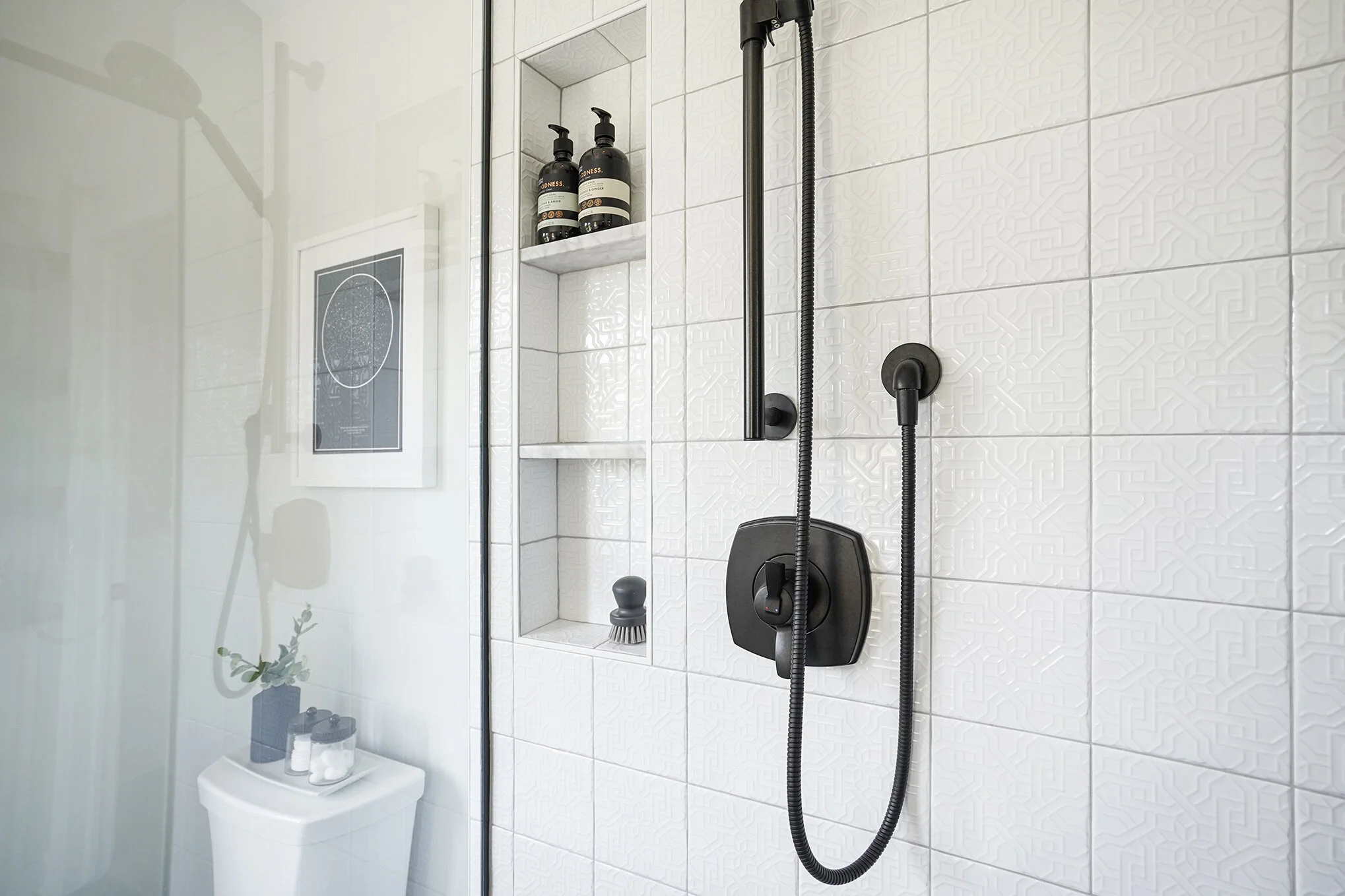
In the shower, we added some black fixtures for a little bit of fun and contrast to the white elements in the space, and chose a patterned wall tile. While the tile is white and neutral, there is visual interest as you get closer and notice that the tile is embossed. It’s small details like this that give us so much joy!
For another touch of detail, we chose a small, black hexagonal tile for the shower floor. You don’t notice it right when you enter the bathroom, but when you get up close, it’s a really effective touch.
Needs a little updating!
We needed some storage in here, so we added lower cabinets and floating shelves to display art, store towels, and make the space feel a little more inviting. Because of the cool tones in the space, they really add some extra warmth and more texture.


