Creating a Serene Primary Suite

Cooler weather is finally upon us, and we are here for it! With the changing of the seasons comes more time indoors, and while it’s easy to feel cooped up, creating a space that lends to relaxation will help those grey days feel like worlds away.

In this post, we’ll focus on two primary suite renovations that we recently completed. While the styles are completely different, the effect of serenity is the same. Here are some tips for creating your dream-like retreat.

The first thing we did in this suite was select a neutral, dreamy, and whimsical wallpaper. Choosing something with softer tones allowed us to play with color elsewhere in the room. We then decided that a deep green velvet bed frame would add another layer of texture and ground the space. Don’t forget candles for ambiance! Scent can be a signal for relaxing, as well as creating a warm, glowy mood when you’re ready to settle in for the night.

With the lamp and the night stands, we chose to incorporate curved, soft-flowing shapes. It gives the space a more relaxed, laid-back feel. Texture is such an important factor to relaxation, so here is where we layered different textiles and added luxurious jewel tones for more pops of color.

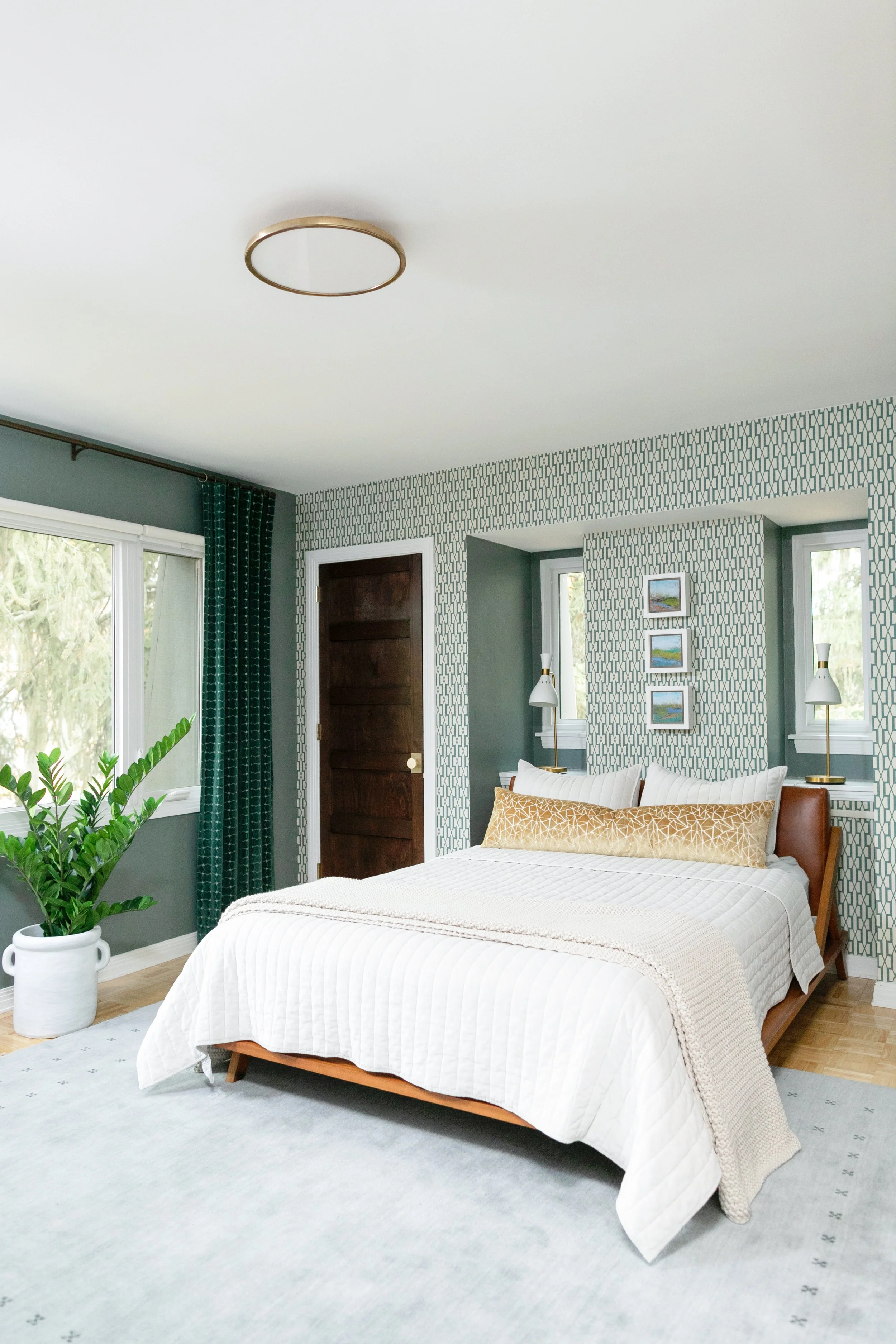
In our second space, we took the same concepts, but flipped them. We included layers of color and texture on the walls, and reserved the neutral, calming tones for the furniture. We chose soft blues and greens for the wallpaper and drapery, and then let the artwork pop. We went with abstract landscape artwork on this project, but still-life art can give the same effect.

We put a soft rug under-foot to begin the relaxation the second you walk into the door. Lastly, we went with rich and inviting textures and colors on the bed with leather, and incorporated a deep-tone wood stain for the closet doors.

Remember these keys to creating your own primary retreat:

  1. Choose calming and relaxing colors (blues, greens, jewel tones).

  2. Layer texture in the rug, bedding, pillows, drapery.

  3. Ground the space with deep rich leather, velvet, or wood tones.

  4. Add something whimsical or unexpected with wallpaper and art/

Most of all, have fun with it! Sweet Dreams…

A Global-Inspired Basement Renovation

Welcome to one of our favorite basement projects to date!

We were heavily inspired by the client’s travels and knew they wanted a colorful space to entertain and relax. We were also tasked with making it kid-friendly for their growing family, and to include a guest room with a full bathroom for visitors. Luckily, we weren’t starting from scratch (if you’re familiar with the term “Michigan basement”, you know what we’re talking about), so it was up to us to strip it down and build it to suit our client’s needs.

In adding an electric fireplace to the right side of the room, we closed off the stairway to create equal spaces on either side. The reeded detail with the sconces on each side of the fireplace wall is one of our favorite features in the living area. We also chose a Samsung Frame TV so that when it’s not in use, it would look like art. This has been a great options for clients who don’t want the look of a regular TV mounted on their wall.

To create additional sleeping space for visitors, we chose this Luonto sleeper sectional. We loved that it provided a second area for the client to have multiple guests at the same time. It can be hard to find an option that’s stylish, functional, and most importantly, comfortable.

There are simple ways to make a space beautiful while also making it functional. In this area, we chose simple soft storage baskets for all the kids’ toys to be tucked away, and still look nice and clean. We know it won’t always be 100% tidied - that’s the nature of children! - but designating a place for their things to go helps keep the space picked up when guests arrive. Here, we even styled the children’s books with beautiful marble book ends.

In designing this wing of the basement, there was a huge unused space underneath the stairs. They weren’t hurting for additional storage, so we decided to add in a wet bar that ended up being one of our favorite features of this project. It also lends as showcase display for the different liquors the clients brought back from their travels.

We sourced a vintage runner that leads you back to the guest bedroom and bathroom to create a colorful warmth to the space. The art we found felt other-worldly and was a nice, neutral touch to the color in the rug.

In addition to international travel, our client has amassed a large collection of Major League Baseball hats. Their goal is to go to a game at every field, and as you can see, their collection is almost complete. Our challenge was to display what he already had and leave enough space for the few they had left to collect. As we laid out each hat to assess the collection, we even found ticket stubs from each game! It took almost two hours, but the reaction when it was finished was all the validation we needed to know that we nailed it.

Putting a neutral paint color underneath the hat display wasn’t something that fit the bill, so we chose a fun color that would make it pop, and also lend to the room being used for guests (Benjamin Moore - Slate Teal). It makes it feel like a nice getaway!

This is also a good example of a space where you can get more accessible art pieces. You don’t always have to invest in expensive art and lighting in every room, but when you mix in pieces from both categories together, you can create a seamless blend of the two.

This long level was a life saver in getting this display just right.

For the full guest bathroom, we sourced a pre-built vanity. This is a great cost-effective option because they come with a countertop and a sink. Because of the size of the bathroom, we went with a subway tile, but wanted to do something a little different and not go with a classic brick set to give it a more elevated look.

We hope you enjoy learning more about the design behind these spaces!

-Kristie & Mikki

Planning a Successful Home Renovation

Beginning a home renovation can be an exciting process, but the glow can quickly wear off if you don’t take the proper steps to set yourself up for success. The pandemic taught us a lot of things, but as we all migrated to working from home during quarantine, it shone a glaring spotlight on our living spaces - what we loved, and mostly, what we hated. Our industry has changed so much since 2020, booming like we never expected. With that in mind, we wanted to give anyone thinking about taking this leap some of our insider tips.

The first, and arguably most important step, is picking your team. Before you even choose your designer and contractor, it’s important to understand what your wants and needs are for your current space. Make a list of what’s working for you and what isn’t, and think about how you want your space to function in the end. Then, a designer will listen to that list of wants and needs and turn it into a clear, concise plan that you can give to any contractor you’re interviewing that lays out what you hope to accomplish. Most importantly, it’s about finding someone who is going to listen to what you want and not push their own agenda and style onto your project. They will bring out your personal style and help make the space function for your life. It’s also important to do research on the team you’re choosing. Seeing some of their projects in person will help you understand the quality they’re able to deliver. Referrals are also a great source in the research process. If someone you know has a connection with a designer or contractor they’ve already worked with, chances are you’re able to see the craftsmanship and know the level of quality you will be getting. Communication is a large part of the process and very important. Listen to your gut in your initial meetings, and choose someone with whom you feel you’ll be able to be honest and direct, and vice versa. Most importantly find someone that listens to you.

As we all know, the pandemic has affected every single industry, and it’s become a major challenge in sourcing materials. From lumber to furniture to plumbing finishes, there seems to be a shortage no matter what your renovation entails. Products are getting stuck in shipping containers, factories are short-staffed, and some businesses simply couldn’t keep their doors open after 2020. Bringing a designer and a contractor to the table means they’ll know what products they can get and what to avoid. It means you get a built-in team who has access to more information about the industry and can guide you on important decisions. We caution clients who want to general contract their own projects, as we have seen the chaos these situations create. You’ll experience longer than the already lengthy lead times because individual tradesmen are booked and often unable to fit a smaller project into their schedule because they are committed to a contractor that gives them consistent work. It leads to poorer communication, a less cohesive and collaborative design, higher costs, and a longer renovation timeline. When selecting finishes with a designer before your project starts, your designer or contractor will be able to order things as soon as they’re quoted and approved and be ready to go when your project starts. Patience is our greatest asset in this process, and it’s often worth the wait.

This Kohler faucet took eight months to arrive, but this vanity wouldn’t be the same without it.

Next up is understanding your budget. What you’re willing to pay for doesn’t necessarily mean what you want is going be in line with that budget, so managing expectations is helpful because of the inflation we’re experiencing right now. We’re seeing upwards of an additional 30% being added to budgets because of the cost of materials. Businesses that need raw material need to adapt and bump up their quotes as well, so projects are coming in higher than what many clients are prepared to pay. While the sticker shock is, well, shocking, it’s important to remember that the pandemic has affected these prices, so letting your contractor know up front what your maximum budget is will help them determine where you can cut costs to achieve your renovation goals. Often the contractor and client will go back and forth because a maximum budget wasn’t discussed. They’ll have to play budget tennis, when being up front and clear with your contractor would have saved everyone a lot of time and energy. Open and honest communication is the best way to get what you want out of a project.

Mixing and matching existing decor with new items can help save you money.

We like to say, “Price the dream,” and then make modifications when necessary.

Elevation view from above coming to life.

Communication, patience, and collaboration are the name of the game, and if you choose the right team to work with, the finished product will be worth every penny.

Historic-Modern Four Square Kitchen

We had the pleasure of designing a new kitchen in this four square historic gem built in 1929. The trademarks of a four square home include a square, boxy design, with four large square rooms on each floor. These homes were known for often incorporating handcrafted "honest" woodwork. End history lesson!

Now, let’s get into the fun stuff! We love projects where there is a Tetris-like challenge that present interesting solutions on the design end that makes the project just that much more rewarding. We were confined to the four walls that enclosed the kitchen because we couldn’t expand into any other space, as it would have been too costly structurally. We also had two support beams in the ceilings enclosed in a bulkhead that we had to design around. As you’ll see, the bulkhead is in the center of the room. We started by centering the range on the bulkhead to line it up visually. With that as a starting point, we were able to get the rest of the design rolling.

KKD_Deaner_Home-16.jpg
Before

Before

One of our intentions while designing this kitchen was staying true to the era of the home, but also blending in modern elements to update the space. We sourced new interior doors with a classic look. The glass helps to create a visual connection with the adjoining rooms.

We wanted the kitchen to flow with the rest of the original features in the house, so we used inspiration from the dining room built-ins for the custom kitchen cabinetry by mimicking the clover leaf profile on the cabinet doors. We also designed them to be inset, which would have been accurate to the period of the home.

KKD_Deaner_Home-28.jpg

While staying true to the classic design of the house was important, we also needed to add modern day elements. We incorporated custom metal shelving with a stained oak shelf, which also ties in with the oversized butcher block island. For continuity, the same metal shelf design was used for the support legs on the dining portion of the island. It gives the space a modernized industrial feel, while the cabinets and soapstone countertops are reminiscent of the era of the home.

As you’ll see throughout the kitchen on the open shelving, we decorated with a mix of antique and handmade items for a collected feel in the kitchen, focusing on things that were not only functional but also beautiful. The green espresso cups were a fun find from Etsy that pulled in the green from the walls and are used daily.

KKD_Deaner_Home-21.jpg

Subway tile would have been used in this home back in the 1930s, but to update it, we chose a beveled subway tile, along with a medium gray grout. We wanted to give this little kitchen some dimension and interest.

The vinyl flooring was removed and then we continued the original oak hardwood flooring that also covers the rest of the main floor. This simple change made for a cohesive and seamless transition.

The family wanted this to be a place where they could share meals, do homework, or set up by the espresso machine to work from home. Gathering around the island for meal prep or to enjoy a home-cooked meal was important to them, so we designed the island to be oversized, with seating on one end to enjoy each other’s company.

The other fun detail we added to this kitchen was a gallery wall full of the family’s history. We were able to choose from a wonderful mix of art and vintage family photos to create a wall that told their story. We placed collected campaign pins in a shadowbox, reframed black and white family photos, and incorporated art from their existing collection to make this kitchen feel personal to them.

We also did a refresh to the small powder bathroom that you can see from the kitchen. We bumped up the saturation of the same green paint that we used in the kitchen. After removing the old flooring, we added a fun black and white checkerboard tile to give this little bathroom some character of its own.

KKD_Deaner_Home-64.jpg

Keep following us here and on our Instagram for updates on our current projects!

Cabinetry: Ascent Fine Cabinetry | Instagram
Contractor: Perkins Custom Remodeling | Instagram
Photography: The Mitten Tog | Instagram

The Laundry Room Kitchen

KKD_CherryValley_websize-69.jpg

The title of this project only makes sense when you hear our reaction upon first seeing this room. “Wow, this laundry room has as much space as a kitchen!” And it does. In fact, it probably has more storage than the average kitchen now that the project is complete!

What began as a dated 90s laundry room space became something functional and funky - an actual area of the house you’d want to spend time in doing household chores.

Before picture

Before picture

Our client needed a more functional laundry room, and we wanted to utilize the ceiling height, so we extended the cabinetry to the ceiling to give them more storage.

Because there was so much usable space in this room, we opted to have a little more fun in here. We chose a bold wallpaper from Copper Corners and two-toned cabinetry with brass pulls. The cabinets are a simple shaker-style that is elevated by the use of mesh metal inserts above the folding station.

While we wanted the look of marble, we also knew the the flooring had to be durable because of the washer and dryer, so we chose a luxury vinyl tile that was installed by Johnson Carpet One. It gave us the look we wanted along with the durability and without the maintenance of marble.

One of our favorite features in the laundry room is this penny round tile. As you walk around the corner into the center of the room, the penny round tile catches your eye with its color and texture and reflects the natural light streaming in from the window. We loved it for its color and repeated circular shape of the cabinet pulls.

KKD_CherryValley_websize-64.jpg

We used this retro-inspired chandelier to add a little more drama. Lighting is art, and can enhance the room if chosen well.

KKD_CherryValley_websize-54.jpg

Stay tuned for the finished mud room reveal coming soon.

Photography by The Mitten Tog

An Island for Days

IMG_9395.jpeg

When we think about dream projects, we often think of clients that understand the importance of investing in selections that will both make an impact in their space and stand the test of time. That’s what we have here in one of our favorite kitchen designs to date.

Originally, there was a wall separating the kitchen and a small office space, the wall was removed to extend the kitchen and dining space. Because there were existing ceiling beams in the back living room adjacent to the kitchen, we tied the spaces together, and placed beams in the dining area and the kitchen for a cohesive design.

We removed the far wall with the cabinets to create the space we needed.

We removed the far wall with the cabinets to create the space we needed.

Designing for a long, narrow space, while tricky, is the kind of challenge we love to face. We decided to use the length to our advantage and create a built-in banquette at one end of the kitchen. It gives a ton of dining space, while also allowing us to give the client the big kitchen space that they needed.

We decided to go with a walnut seat as opposed to painting it to prevent scratching from every day use, and for the ease of sliding in and out from behind the table. You’ll notice a small reeded detail on the sides of the seat, which is mimicked in the island as well. The back of the banquette is a beautiful European leather. For the table, we worked with Huizen's Furniture to create a custom Amish-made dining table to the exact size required.

Given that we had a lot of length to work with after we’d designed the banquette, we really went all out with the island. One end is quartz with waterfall sides, which contains storage on both sides of the island, while the other is a beautiful butcher block top, with seating on one side. We loved being able to incorporate ample work space and storage in this elongated island, with plenty of room to spread out.

Cabinets by Grabill through True Kitchens  •  https://www.circalighting.com/clarkson-small-single-pendant-arn5033/

Cabinets by Grabill through True KitchensPendant Lights

KristieKDesigns_Spear_Home-49.jpg

Lighting was a huge feature in this kitchen. We wanted it to be intentional, but not too overwhelming in the space, and what we found from Visual Comfort was just the right amount of stylish and classic.

We added a custom Roman shade over the sink to provide a bit of softness to the tiled wall and cabinets. The zellige tile has variegated colors to give the backsplash a bit of interest, while still being a classic and inviting look.

The coolest feature in this kitchen is what we’re calling the Coffee Bar. We continued the walnut butcher block from the island to this bank of cabinets. The tile is a stunning mosaic glass by Artistic Tile, and even though it is absolutely eye-catching, the focal point of this space is the framed artwork by James Karsina from LaFontsee Gallery. It reminded the clients of their trips to northern Michigan, and is a beautiful addition to this space.

The Coffee Bar before

The Coffee Bar before

We are so pleased with how this project came together, and can’t wait to show you more from this house. Stay tuned for the front room and foyer!

Other links:

Coffee Bar Tile (in Ice White)

Shaw Flooring (in Crema)

Quartz Countertops (in Calacatta Gold Polished)

Appliances (in Matte White)

TheMittenTog Photography

Contractor - Insignia Homes

The 50’s Charmer

We live for renovating homes that haven’t been touched in years! This 1950’s gem in East Grand Rapids, Michigan had great bones and so much potential when we first walked through. We love that we were able to modernize the residence while still staying true to the home’s classic styling. You won’t believe the before and after shots!

In the foyer, we knew that we wanted to include a welcoming wallpaper to catch your eye as you entered. The wallpaper also needed to be understated so as not to overwhelm the small foyer. We chose something light, but with texture and botanical interest.

Foyer Before

Foyer Before

Look at that hexagon floor tile!

Look at that hexagon floor tile!

We went with a rich, three inch hexagon tile to ground the foyer and contrast with the wallpaper. We added new doors to the coat closet and painted the front door a deep green. A new ceiling light was added to cast a welcoming glow on all who enter.

The main floor bathroom, as you’ll see, was extremely pink! We carried the dark green paint color from the foyer to the bathroom cabinetry and sourced a leathered granite countertop that added depth to the whole room. We specified frosted glass in the upper cabinet so that the dark green didn’t feel heavy and ominous in the space.

Pink Bathroom Before

Pink Bathroom Before

In the shower, we used an elongated subway tile to introduce texture that was classic and simple, and added marble shampoo niches for visual interest and to give plenty of storage.

We finished the space with chrome features throughout and added vintage artwork that our clients purchased over the toilet. We also used the same hexagon tile from the foyer in the bathroom, but went with a lighter marbled color to keep the space nice and bright.

Photo Oct 28, 3 46 00 PM.jpg

Before the renovation, there was only a tiny doorway between kitchen and dining room. We completely opened the wall so the kitchen could have more of a relationship with the living room and dining room.

Kitchen before we opened the doorway to the dining room

Kitchen before we opened the doorway to the dining room

The counters are a beautiful natural soapstone, while the peninsula top is solid walnut. On the walls, we chose a marble subway tile and wrapped it all the way around the opening to the dining room. We added walnut shelves next to the range to match the peninsula top and for extra display space.

Photo Oct 28, 3 55 50 PM.jpg

This project holds a first time feature for us at Kristie Koning Design! We specified a flush mount recessed vent hood into the ceiling above the oven. Because it was a ranch style home, we could access the attic space above the kitchen to recess the vent hood to be flush with the ceiling so the view of the dining room wouldn’t be impeded.

We grounded the space with a dark porcelain tile that mimics natural slate and continued the chrome fixtures throughout the kitchen and on the cabinet knobs. The frosted glass mullion doors enhance the overall look of the space to make it feel light and open. Because we wanted to utilize every inch of space in this small kitchen, we used a wall mount microwave that sits flush with the upper cabinets as opposed to protruding out into the space.

Before - View from the dining room into the kitchen

Before - View from the dining room into the kitchen

Photo Oct 28, 3 39 11 PM.jpg

Above the basement steps, we created a message center with the dog dishes below. It’s a convenient and out-of-the-way space to keep mail and other items the client may need on a daily basis.

Love this roman shade detail with the marble and wall sconce!

Love this roman shade detail with the marble and wall sconce!

We hope you love this renovated space as much as we do! Until the next project reveal!

Black & White Modern Ranch Reno - Kitchen Edition

The kitchen we are revealing today is a dramatic improvement for this 1960’s ranch that previously had an extremely outdated aesthetic (see below!). The clients built an addition onto the existing house which created a mudroom, laundry room, master bath, and two-story garage. They also gutted the inside of the house to create an open floor plan. Today, we are focusing on the kitchen portion of the renovation.

Kitchen Before

Kitchen Before

During the kitchen design process, we learned that the client wanted modern, clean lines with a simple, straight-forward design. We chose oak hardwood floors along with white oak cabinetry that mixed nicely for an overall clean visual. We also added a white oak mantle above the alcove range to create a cohesive aesthetic between floors and cabinetry.

Kitchen Mood Board

Kitchen Mood Board

KKD_DoornbosHome-56.jpg

The focal point of this space is definitely the alcove range. The backsplash is entirely quartz which creates a seamless look and easy maintenance. For the niches on either side of the alcove we used Artistic Tile’s thin marble herringbone with dark grey grout to add visual interest and texture.

KKD_DoornbosHome-5.jpg

For added warmth, we chose brass fixtures. The cabinet knobs are made of both brass and acrylic so they’re visually delicate but also add a touch of sparkle to the space. Check out the island legs and you’ll find a touch of brass for an unexpected surprise.

One of our favorite features has to be the backsplash behind the sink. We LOVE when a client goes for it! The tile was laid vertically and brick-stacked to draw the eye upward and make the space appear taller. The emerald green hue added a rich and beautiful contrast to the white oak and painted cabinets custom built by Ascent Fine Cabinetry.

Per usual we had so much fun with lighting in this space. We wanted something a little bold that created a statement. The island lights bring in the bold and the wall sconces over the sink definitely create a statement. We believe that lighting is just as important as art in any space!

Just because a space is beautiful doesn’t mean it can’t also be functional. In this kitchen, we built in loads of useful storage features throughout.

Thanks for following along! We just love the finished product!

Thanks for following along! We just love the finished product!

Warm & Welcoming Main Floor Renovation

Photo Oct 06, 11 30 28 AM.jpg

Because our client has a love of baking, let’s start this renovation in the kitchen. Her main goal was a classic and neutral overall palette with a lot of texture built in - and we definitely were able to give her that!

We kept the cabinets a classic white, but gave it a nice contrast in the gray island. We also added some modern features by using black cabinet pulls, a black faucet, and pot filler.

One of our favorite features in this baker’s paradise is the decorative marble tile backsplash under the range. It was also important to our client to have both the range and the wall oven to indulge her time in the kitchen.

Kitchen Mood Board

Kitchen Mood Board

Kitchen before

Kitchen before

Because of the massive dining table, we doubled up two lantern-style chandeliers and we needed the lighting in this space to balance the weight of it visually. It casts the right amount of light, but doesn’t overwhelm the space.

For some visual interest in the dining room, we incorporated this beautiful vintage piece from The Honeysuckle Co.

Photo Oct 06, 10 43 41 AM.jpg

Moving from the kitchen to the living room, we renovated the staircase railing, balusters, and stair treads, which completely changed the aesthetic of the room. The rich wood stained railing ties the wood tones together throughout the entire space.

Living Room Mood Board

Living Room Mood Board

Photo Oct 06, 11 21 11 AM.jpg

We also tackled the fireplace by giving it a facelift. We used shiplap and decorative wood mullions to created the gridded pattern. We included the same quartz used on the kitchen counters to tie both spaces together.

In both spaces, we used Coretec vinyl planking which is durable - with three kids and a dog, that was very important! We then tied the floor into the fireplace by using a dark wood stain on the wood mantle.

Cozy and inviting was the name of the game in the living room. We chose leather armchairs and a neutral rug to blend with the coffee table and the sofa that the client already owned. We love that they fit in with our overall design.

Living room before

Living room before

The main floor also has a powder room that needed updating. We used a textural wallpaper and paired it with a vanity that is open below. In a small bathroom like this, it really helps make it feel like it has a lot of floor space.

Powder Bath Mood Board

Powder Bath Mood Board

Powder room before

Powder room before

We used the same quartz from the kitchen for a backsplash to protect the wall and tie it in to the rest of the main floor renovations. We also chose a really fun wall-mounted faucet.

Photo Oct 06, 10 23 24 AM.jpg

The last space in this main floor renovation is the foyer. We continued the vinyl planking and added a welcoming rug. We chose this large print from Juniper Print Shop and topped it off with a small stool and some greens.

Photo Oct 06, 11 46 35 AM.jpg

Modern / Classic Laundry Room

Photo Aug 19, 10 54 08 AM.jpg

This is the second half of the Grown Up Glam Guest Bath. Originally, the laundry room and full bathroom were combined, but we really wanted to make these spaces their own. In the renovation, we split the two rooms mostly down the middle and were able to keep the skylight, providing more natural lighting.

Because we didn’t want the storage cabinet to make this room feel heavy or too solid, we chose a frosted glass to put on the upper cabinets from Legacy Crafted Cabinets. The color was custom from Sherwin Williams, and gives the space some color without being the center of attention. We included extra storage for laundry baskets under the countertop.

To add some interest to this room, we added a fun and funky modern light fixture.

For the countertops, we incorporated this beautiful waterfall quartz edge - beautiful and functional.

Photo Aug 19, 10 55 17 AM.jpg

The real star of this room is the floor tile from the Tile Shop. It defines the space and makes it interesting. It’s a fun pop of pattern in a room that usually only functions as utility.

We love greenery here at Kristie Koning Design. Just because a room is merely for function, doesn’t mean it it should be ignored in the decor department. We added this ledge for whatever the client wanted to use it for - detergent or art! Because there’s so much natural light, it’s the perfect space to bring in a little life.

Photo+Aug+19%2C+11+35+56+AM.jpg
Photo Aug 19, 11 40 24 AM.jpg
The left side of this picture is where the new laundry room is.

The left side of this picture is where the new laundry room is.

Grown Up Glam Guest Bath

Today we’re looking at a guest bathroom that started out as a laundry room and full bath combined. The client wanted a nice-looking and functional guest bathroom, so we divided the space into two separate rooms, working around the existing skylight to give the bathroom a ton of natural light.

Light was actually a very important aspect in the guest bath for the client, so we incorporated an LED medicine cabinet for both its storage and extra recessed lighting, and brought in gold sconces to bring out the client’s glam side.

The vanity is in this nook where the washer and dryer used to be.

The vanity is in this nook where the washer and dryer used to be.

We wanted to fit a full tub in this bathroom to make it feel like a serene getaway at a luxurious hotel, so we placed it in the center of the room. We included double doors on the shower/bath combo so that you wouldn’t feel caged in should you want to unwind at the end of the day with a bubble bath. We added brass details to match the vanity.

To keep the palette simple, clean, and fresh, we used a textured subway tile in the shower and behind the vanity. For an added layer of texture and interest, we chose a grey, geometric wallpaper, and to tie everything together and ground the space, we went with a black floor. Because of the cool tones of the tile and wallpaper, we brought in some natural wood with the cherry vanity and matched the floating shelves in the nook to the vanity to warm it up.

Photo Aug 19, 10 38 50 AM.jpg
Photo Aug 19, 10 32 24 AM.jpg
This before pictures shows the  skylight and toilet location, neither of which were moved in the renovation.

This before pictures shows the skylight and toilet location, neither of which were moved in the renovation.

The rest of this renovation can be found here.

Other links:
Perkins Custom Remodeling
Direct Supply, Inc.

Black and Mod Basement Reno

1061AutumnRidge_28.jpg

This client had a clear vision of what they wanted this space to be and how they wanted to use it because it would be a multi-functional space in this one area.

The main space was created for TV viewing. Whether it’s curling up and relaxing or watching a big game, this are needed a big comfy couch to set it apart from the rest of the space.

It’s easy to be wary of dark trim in a basement space, but with so much light we went for it! Dark trim and a black shiplap on the projector area and the kitchen island tie nicely into the black and white theme of this space. We warmed it up with the flooring and wood elements throughout the space.

The next space is behind the TV viewing an area - a place for entertaining. The fireplace was completely updated. We wanted it to have a concrete look, but a full concrete fireplace wasn’t in the budget, so we selected a tile that looked like concrete. From there, we created a grid pattern and divided up the sections with metal strips to give it a more interesting look, and less like we just tiled the face of the fireplace.

From there we added a seating area for happy hour drinks and accent lighting to either side of the fireplace. It gives the area a good wash of light over the client’s artwork and adds richness to the space.

1061AutumnRidge.jpg

Next, we created a large bar area with a lot of seating so you can see the TV from any spot. We added a kitchen with beverage coolers and included a dishwasher and sink. No bar space would be complete without open shelving to display adult beverages!

1061AutumnRidge_68.jpg

Next to the bar area is a wine room. Originally we wanted to make the space under the stairs flush with the stairs, but we weren’t able to do that. Instead, we added the detail of the glass sides so you can see into the wine room. We stayed true to the original structure, but made it a focal point and a place to store wine that was also near the bar.

1061AutumnRidge_46.jpg
1061AutumnRidge_35.jpg

Don’t worry - we didn’t forget the kids! Beyond the custom-made pocket doors is a playroom space just for them, with a guest room for family and friends.

1061AutumnRidge_74.jpg

The last space in this renovation was the bathroom. We kept on theme with the black and white to tie in with the rest of the space, but we let loose and got a little funky. We chose a floating vanity and prismatic black tile behind. To offset the circle mirror, we used fun geometric lighting.

1061AutumnRidge_24.jpg

The Serene Master Bath

For this project, our client had a very clear vision - contemporary, but not too modern with some classic elements. With that in mind, we started by removing the corner garden tub and installed a free-standing slipper tub in its place. For an added touch of interest, we added a chandelier above it.

Garden tub could use a little improving, don’t you think?

Garden tub could use a little improving, don’t you think?

Because there was so much natural light in this space, we weren’t afraid to go darker on the floors and the vanity. It warms up the room, and also lets the angled tub pop against it. We accessorized the entire room with a mixture of old a new, like this antique piano stool next to the tub.

photo jun 17, 10 41 31 am.jpg

We brought in some of the classic elements in the vanity with its turned leg and added subway tile behind the vanity for added layering and depth to the space. We removed the overhead lighting and used a funky frosted-glass style sconce between the two oval mirrors.

The vanity before.

The vanity before.

fullsizeoutput_1b1.jpeg

In the shower, we added some black fixtures for a little bit of fun and contrast to the white elements in the space, and chose a patterned wall tile. While the tile is white and neutral, there is visual interest as you get closer and notice that the tile is embossed. It’s small details like this that give us so much joy!

For another touch of detail, we chose a small, black hexagonal tile for the shower floor. You don’t notice it right when you enter the bathroom, but when you get up close, it’s a really effective touch.

photo jun 17, 11 25 01 am.jpg
photo jun 17, 10 57 41 am.jpg
Needs a little updating!

Needs a little updating!

We needed some storage in here, so we added lower cabinets and floating shelves to display art, store towels, and make the space feel a little more inviting. Because of the cool tones in the space, they really add some extra warmth and more texture.

photo jun 17, 11 15 29 am.jpg
photo jun 17, 10 37 47 am.jpg