Because our client has a love of baking, let’s start this renovation in the kitchen. Her main goal was a classic and neutral overall palette with a lot of texture built in - and we definitely were able to give her that!
We kept the cabinets a classic white, but gave it a nice contrast in the gray island. We also added some modern features by using black cabinet pulls, a black faucet, and pot filler.
One of our favorite features in this baker’s paradise is the decorative marble tile backsplash under the range. It was also important to our client to have both the range and the wall oven to indulge her time in the kitchen.

Kitchen Mood Board


Kitchen before
Because of the massive dining table, we doubled up two lantern-style chandeliers and we needed the lighting in this space to balance the weight of it visually. It casts the right amount of light, but doesn’t overwhelm the space.

For some visual interest in the dining room, we incorporated this beautiful vintage piece from The Honeysuckle Co.

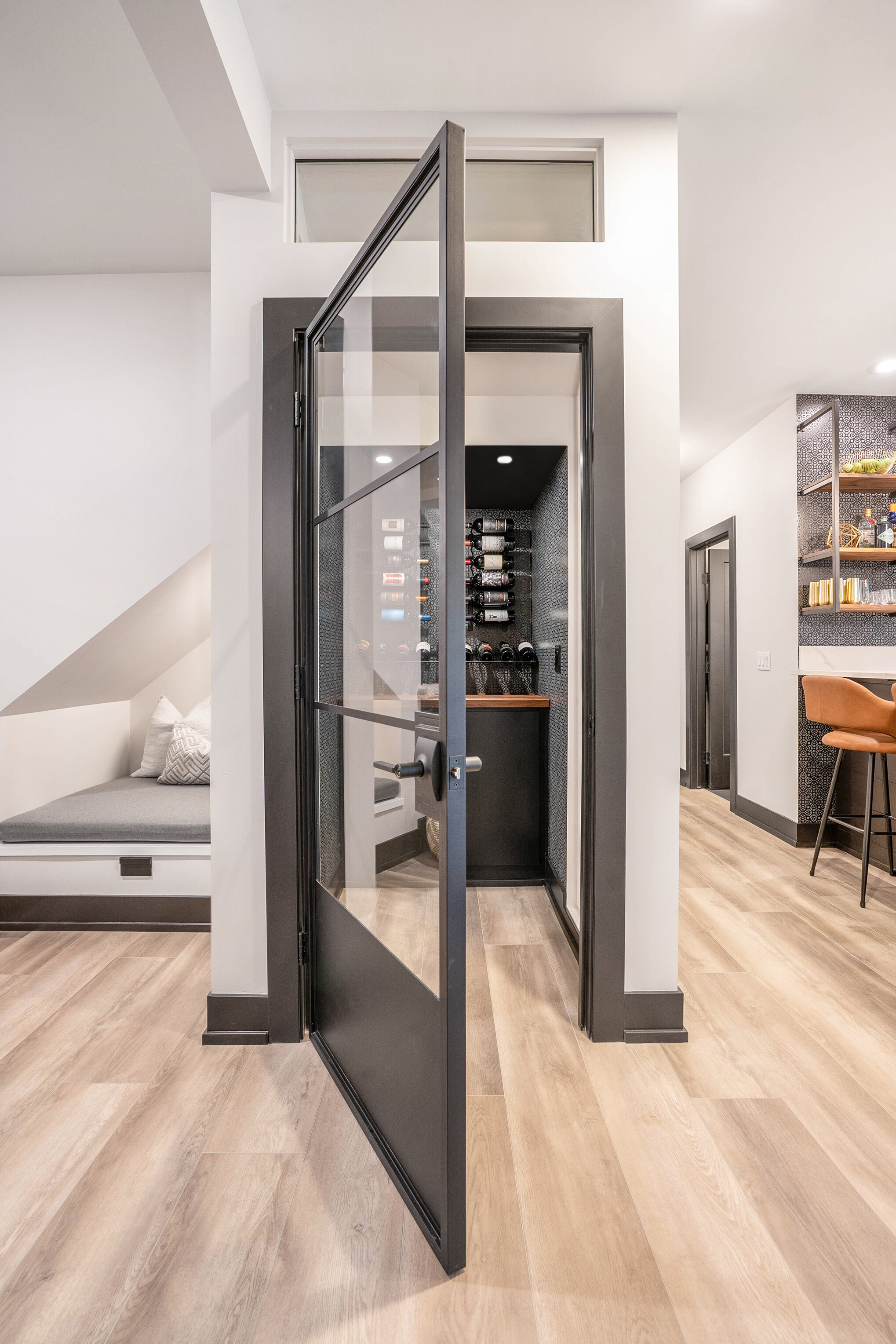
Moving from the kitchen to the living room, we renovated the staircase railing, balusters, and stair treads, which completely changed the aesthetic of the room. The rich wood stained railing ties the wood tones together throughout the entire space.
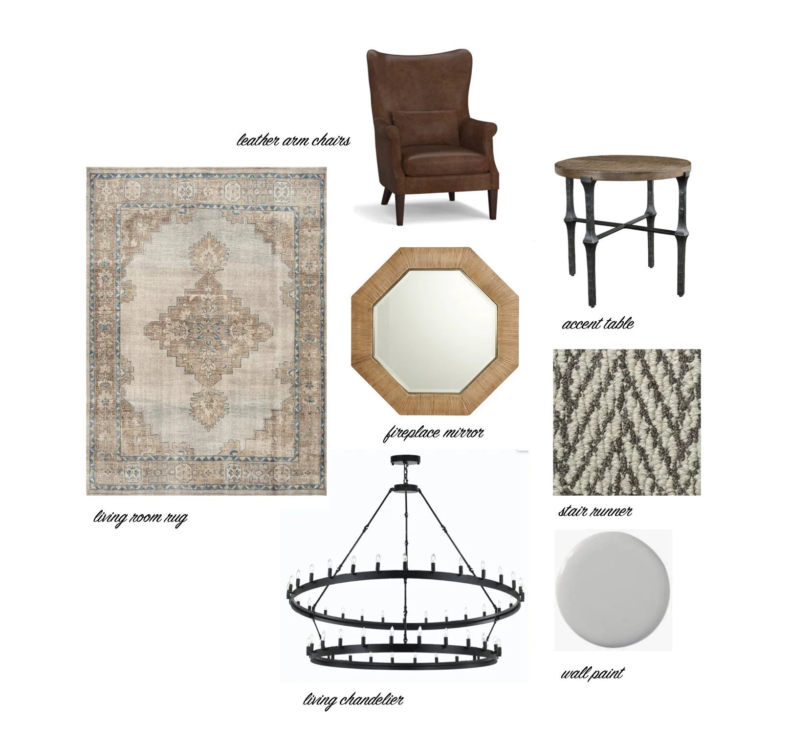
Living Room Mood Board

We also tackled the fireplace by giving it a facelift. We used shiplap and decorative wood mullions to created the gridded pattern. We included the same quartz used on the kitchen counters to tie both spaces together.
In both spaces, we used Coretec vinyl planking which is durable - with three kids and a dog, that was very important! We then tied the floor into the fireplace by using a dark wood stain on the wood mantle.

Cozy and inviting was the name of the game in the living room. We chose leather armchairs and a neutral rug to blend with the coffee table and the sofa that the client already owned. We love that they fit in with our overall design.


Living room before
The main floor also has a powder room that needed updating. We used a textural wallpaper and paired it with a vanity that is open below. In a small bathroom like this, it really helps make it feel like it has a lot of floor space.

Powder Bath Mood Board


Powder room before
We used the same quartz from the kitchen for a backsplash to protect the wall and tie it in to the rest of the main floor renovations. We also chose a really fun wall-mounted faucet.

The last space in this main floor renovation is the foyer. We continued the vinyl planking and added a welcoming rug. We chose this large print from Juniper Print Shop and topped it off with a small stool and some greens.